
Case study / 01
Design + development / Live
Craft Applied
A complex offer, made clear.
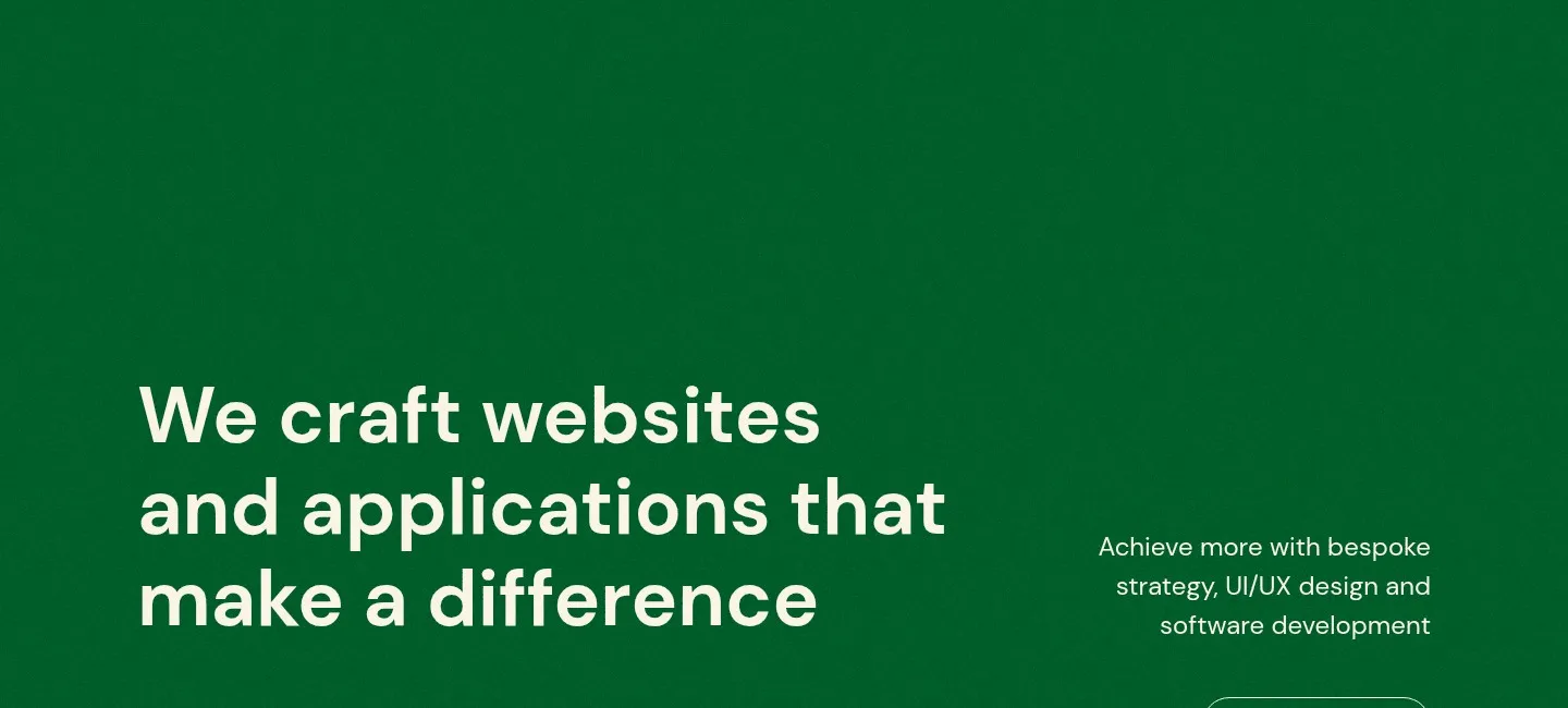
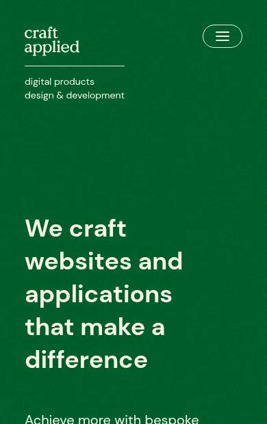
Craft Applied works across product design, development, communications, cloud, and marketing. We created a clear digital system that makes that breadth easier to understand without flattening the expertise behind it.
- Client
- Craft Applied
- Role
- Design + development
- Focus
- Strategy, UX/UI, content architecture, engineering
- Platform
- Astro, SolidJS, TailwindCSS, Plausible
01The challenge
Depth was the strength. It was also the problem.
Craft Applied’s offer reaches from product thinking and interface design to software, cloud systems, communications, and marketing. Presented as one long list, that range was difficult to scan and even harder to remember.
The job was not to reduce the offer. It was to make the depth legible.
02The clarity system
Six disciplines. One coherent way in.
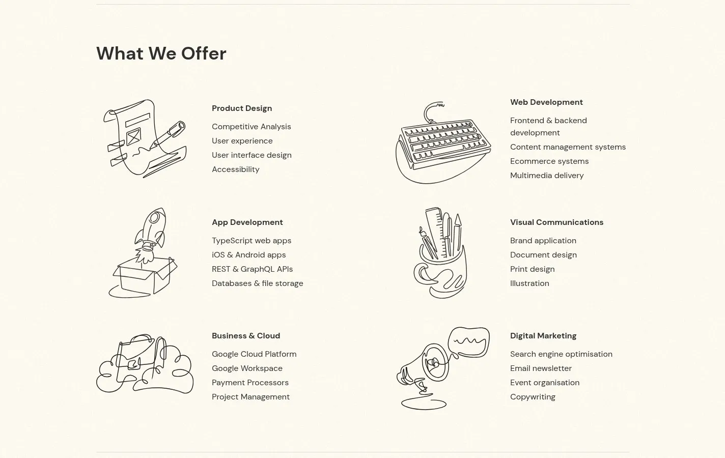
We organized the offer into six distinct disciplines, then gave every detailed capability a clear home. Visitors can understand the whole practice quickly and still move into the depth that matters to them.
- 01
Product Design
Competitive analysis, user experience, interface design, accessibility
- 02
Web Development
Frontend and backend development, content systems, ecommerce, multimedia
- 03
App Development
Web and mobile applications, APIs, databases, file storage
- 04
Visual Communications
Brand application, documents, print, illustration
- 05
Business & Cloud
Cloud platforms, workspace systems, payments, project management
- 06
Digital Marketing
Search, email, events, copywriting
03Work + proof
Let the work do the explaining.
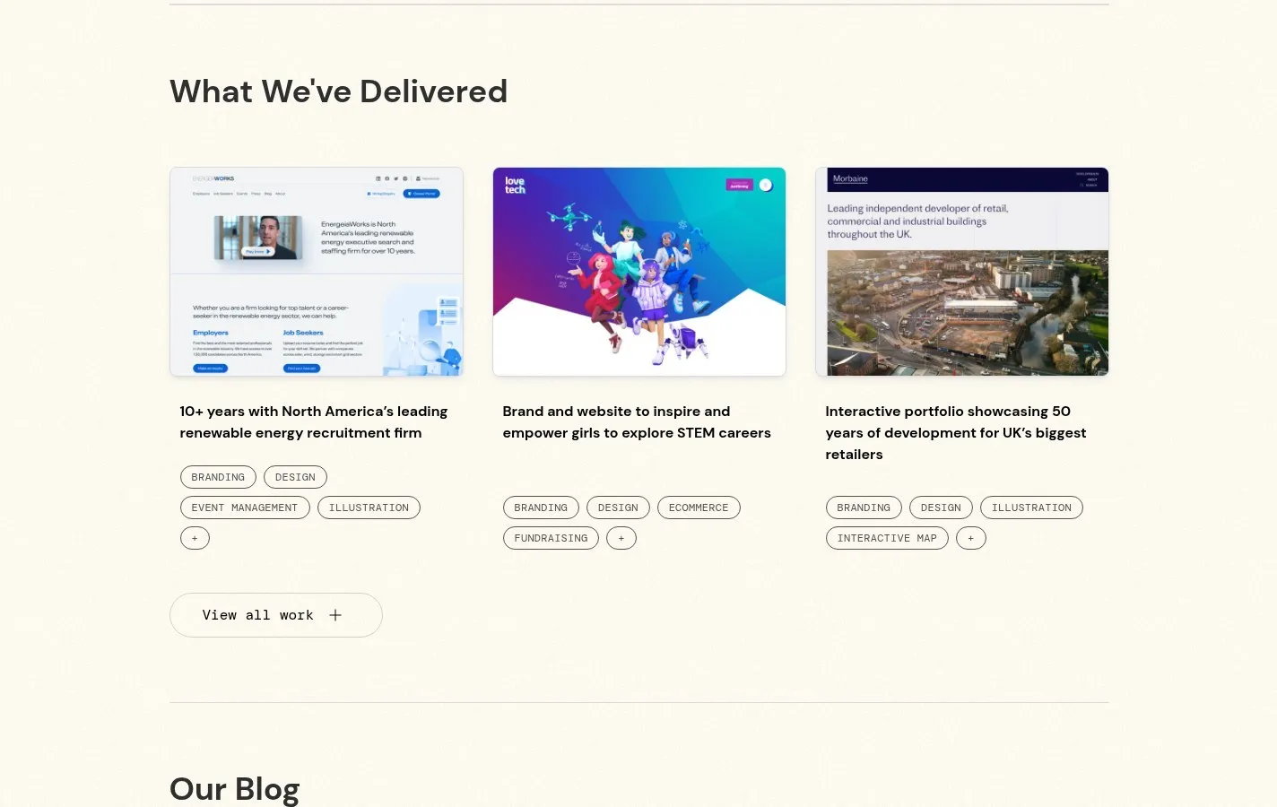
The service system sets expectations; the work makes those capabilities tangible. Project stories connect disciplines to real engagements, helping visitors move from “what they do” to “what that looks like in practice.”
04Editorial depth
A site built to keep thinking.
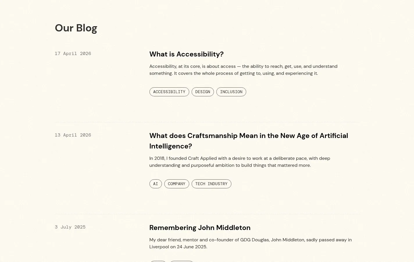
Editorial content gives Craft Applied room to explain its point of view beyond project launches. The same hierarchy and restrained visual language carry through to a publishing system designed for clarity over time.
05Accessible execution
Clarity has to work for everyone.
Accessibility shaped the interface rather than arriving as a final checklist. Clear hierarchy, readable type, semantic structure, keyboard-aware navigation, and responsive layouts keep the experience understandable across devices and ways of browsing.
- 01
Readable hierarchy
- 02
Keyboard-aware interaction
- 03
Responsive by default
06What shipped
A durable platform, not a finished poster.
The result is a content-rich website with a clear service model, reusable publishing patterns, and an accessible responsive interface built to hold new work and thinking without losing the structure that makes it useful.
- Strategy
- Offer hierarchy and content architecture
- Experience
- Responsive UX/UI and visual system
- Engineering
- Astro, SolidJS, and reusable components
- Publishing
- Work, editorial, and structured content patterns
Have a complex story?